
Welcome back to Brand ID Weekly!
This week we’re stepping into the spotlight with ÓPERA — a Brazilian real estate brand that brings architectural precision and cultural richness center stage.
Designed by Gegê Lima this identity is all about elegance, harmony, and the drama of details done right.
From the circular “O” symbol evoking a grand theater to a refined sans-serif wordmark, every element plays its part in this visual symphony. The color palette skips the corporate clichés, opting instead for hues that feel elevated and emotionally resonant — a nod to the world of performance and luxury living.
Take your seat, this show’s about to start…


The letter “O” in the logomark is designed to subtly mimic a theater arch. The name is also obviously a direct reference to opera houses and all the grandeur that includes. It’s cool to see a real estate development brand lean into a high end artistic look.


There’s a rhythmic quality to ÓPERA’s layouts — grid systems that breathe, typography that feels balanced, and imagery that supports the brand’s architectural focus. Nothing feels accidental. Like a symphony composed with care, the brand’s design language reinforces the idea that excellence isn’t loud — it’s intentional.


Rather than fall into the safe zone of blues and grays typical of the construction space, ÓPERA leans into a more cultured palette — coral red, muted lilac, rich navy, and soft beige. The colors feel premium, theatrical, and distinctly non-corporate. It’s an identity that stands out locally without resorting to flash — it earns attention through taste.


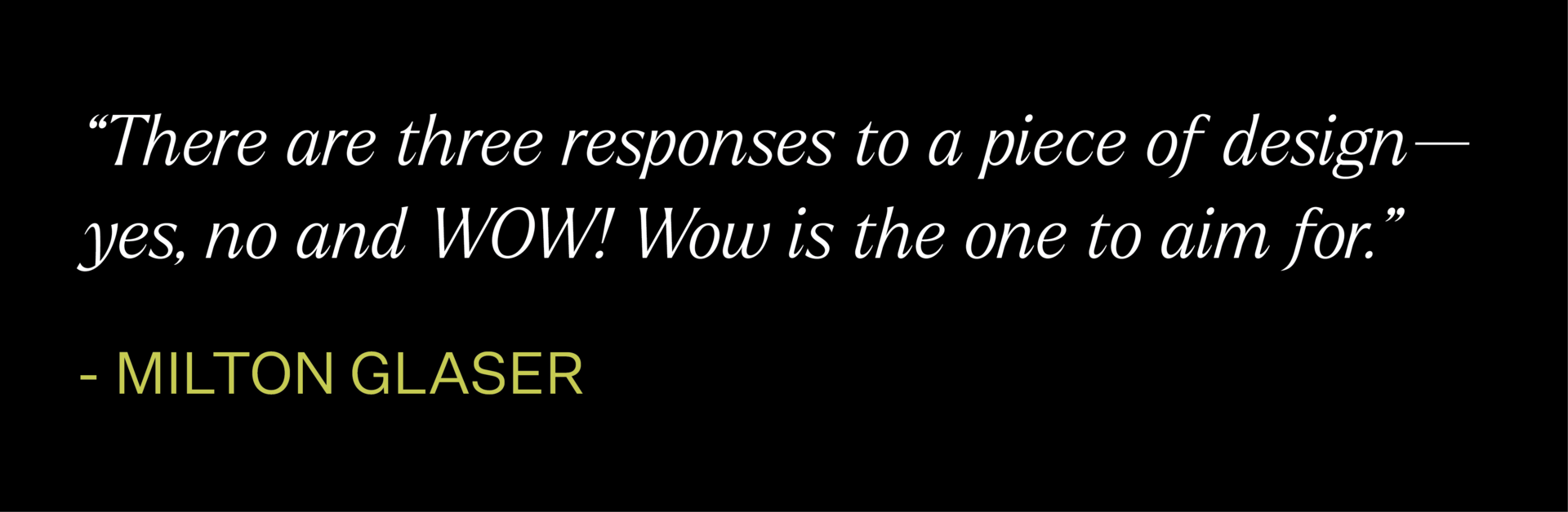
The Weekly Quote
The Remote Job Board
Senior Designer at Zoom
Apply HereVisual Design Lead at Huge:
Apply HereCreative Director at Alma:
Apply HereDesign Director at Axios:
Apply HereGraphic Designer at Resident:
Apply Here
Want to submit your brand?
email : [email protected]
Thanks so much for reading! see you next week. (if you were forwarded this email from a friend - you can subscribe below)